Corporate Identity
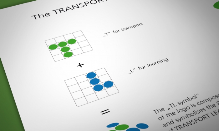
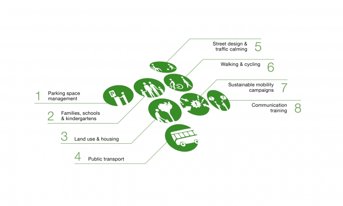
Central to this project were 8 modules dedicated to sustainable mobility. Connected to this topic over 60 trainings in 8 European countries were carried out. Part of the TRANSPORT LEARNING logo is assembled from 8 single dots symbolising the initial letters of the project title, T and L. The 8 dots also represent the number of training modules.
Output
- Logo design
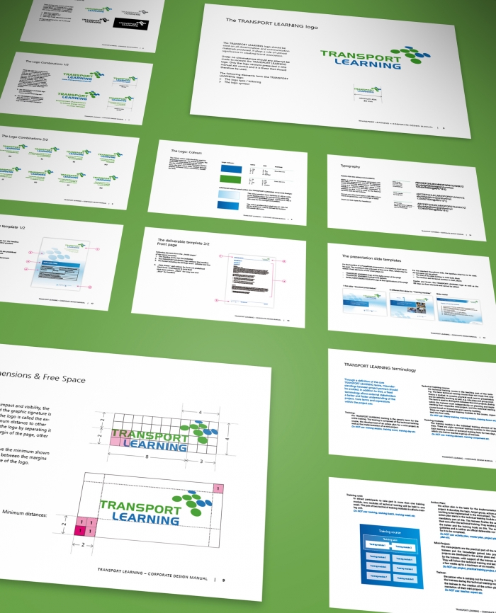
- Corporate Identity and Visual Design Guidelines
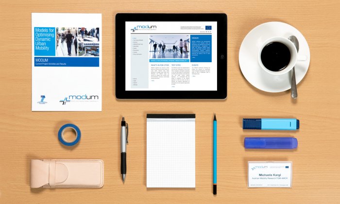
- Flyer, Posters, Brochures
- Design support for events
- 8 E-Magazines
- Templates for MS-Office and project presentations
- Website: Screen design, programming and maintenance
Facts
Released:
2011
Client:
European Commission
Distribution area:
Europe
Services
- Logo design
- Corporate identity
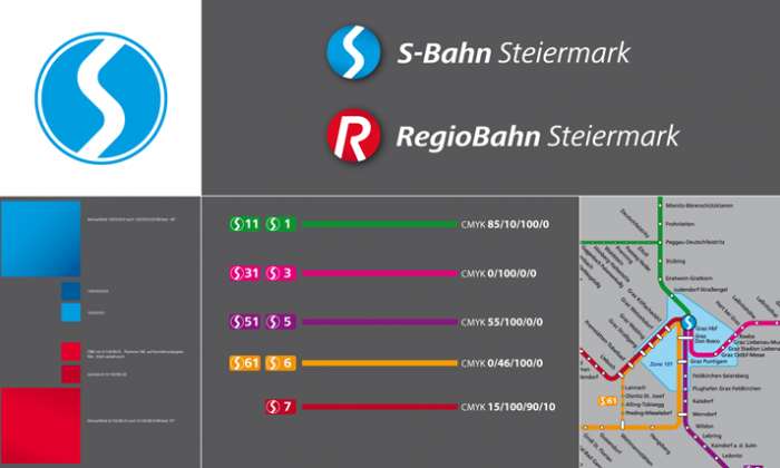
- Visual identity guidelines
More
Less
Part of...
TRANSPORT LEARNING was an EU-project, which ran from 2011 to 2013. It was designed to support practitioners to develop better solutions for urban…>> more

